How to improve the design of a product card in an online store
Author - Constantin Nacul
How to design the main fields of the product card
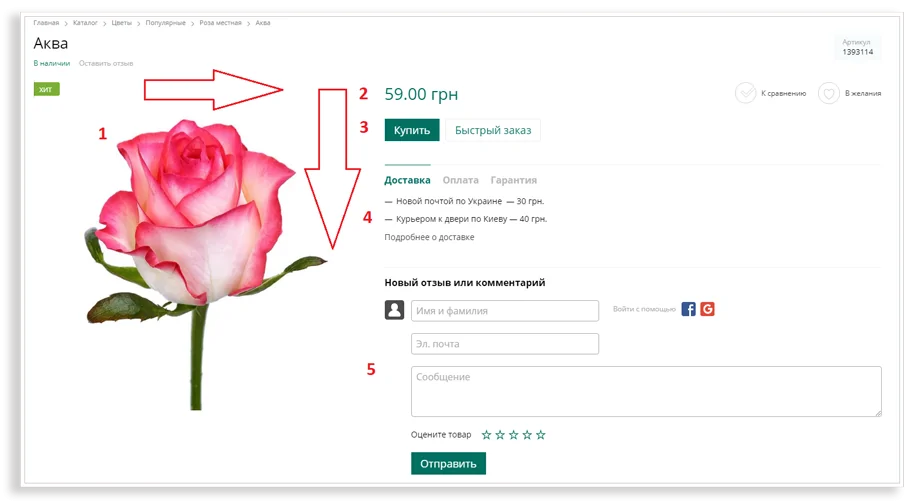
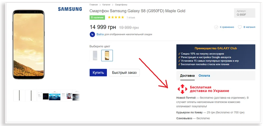
When the user opens the page, he should immediately pay attention to the photo, the price, the terms of payment and delivery, and the "Buy" button. That's why designers make these reference objects bright and place them along the user's gaze path. The main anchor and the brightest spot is the photo, from which the user begins to view the page.
Photos and videos
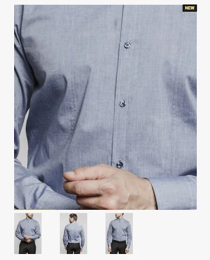
Customers cannot see the product live or touch it, so the photos must be of high quality and varied. You need to demonstrate the product from different angles, as well as show its texture and details.
On the product card, you can use the magnifying glass function to give the customer the opportunity to view the product in more detail. With its help, users will be able to zoom in on any part of the picture.
If the product can be shown during use, do it. For example, when users see a dress worn by a female model, they will be able to better appreciate its fit and overall look.
Not all products require detailing in photographs. If you're selling PC games, it's best to focus on detailed descriptions, tutorial videos, etc. Sometimes it is enough to show the original packaging in the photo.
If you have enough resources, you should shoot video reviews: talk about the features of the product, show how they look live. A good video will highlight all the beneficial aspects of the product in a short period of time.
The price of the product
It should be one of the central elements of the product card. Many users choose products based on price. To further motivate a customer to buy a product and visually show the savings, use a crossed-out old price.
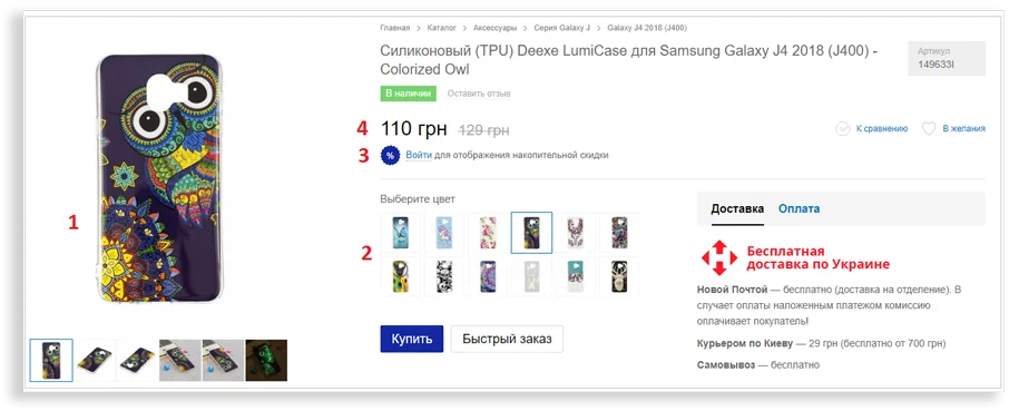
Very often, the price is looked at first of all, so it should be placed at the top of the page near the bright “Buy” button. If the price is not too profitable, you can divert attention from it by placing bright modifications or loyalty program conditions nearby.
The gaze does not move immediately to the price, but through various modifications and an offer to register and get a discount.
Buy Button
The "Buy" or "Add to Cart" button must be highlighted. The space around it should be free so that nothing distracts the user from his main task - to buy a product.
A few tips for the "Buy" button:
- its color should be different from the color scheme of the online store for greater contrast;
- the button should be large and attract the attention of visitors;
- it should clearly state what users should do.
Button "Order in one click" or "Quick order"
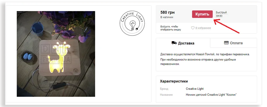
This button is needed for users who do not want to fill in information about themselves and prefer to discuss the details of the order with the manager over the phone. It should be placed next to the "Buy" button, but made less noticeable. It is more profitable for an online store for customers to fill in information about themselves, this helps in collecting the base for email marketing and creating personalized mailings.
Product description and characteristics
Some users understand the products you sell, some don't. Product information should be useful and understandable to everyone.
- Anticipate questions your customers may have and answer them in the description.
- Place the main information at the beginning of the text. You can highlight it in bold.
- If the description text is long, use subheadings and paragraphs to make it easier to read.
- If you can shorten the text without losing information, do it.
Present products as part of a particular lifestyle. Think about how your product can help make your users' lives more fun, enjoyable, or efficient. Show how a bike can make a client healthier and happier; or how sunglasses will help him stay on trend.
If necessary, explain how you formed the price. Many customers prefer not to buy expensive goods in online stores. If you decide to work with the premium segment, the product card should explain why the price is so high: tell us about the cost of high-quality materials, production features, etc.
Testimonials
The presence of reviews adds credibility to the product page and increases conversion. Text reviews, Instagram photos, video reviews are great ways to build consumer trust. To motivate customers to leave reviews, you can invite them to ask questions right on the product card.
Text reviews
Reviews from Instagram
Do not delete negative reviews. They increase the credibility of your online store. Answer them correctly.
Choice of modifications
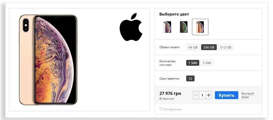
This feature allows you to go to the same product with a single click, but in a different color, from a different material, etc. It is very convenient if when switching the color icon, the product is automatically repainted.
When implementing such a feature, pay attention not only to logic and convenience, but also to examples of competitors. For example, in online furniture stores, it is customary to place the available colors of products in colored squares. Users are already accustomed to this view. If you want to go beyond the accepted rules, it should be done very carefully.
Modifications should be placed in a logical order: the price is on top, then the choice of color, the choice of memory size and the "Buy" button. This gives users a clear algorithm of actions and motivates them to make a purchase.
If there are not too many options, and their names are not too long, it is better to show all modifications in a row, without using a drop-down list. Clicking on the list is an extra action that you can most often do without.
Modifications that are not available, it is better to make them gray. Unnecessary clicks to products that are out of stock annoy users.
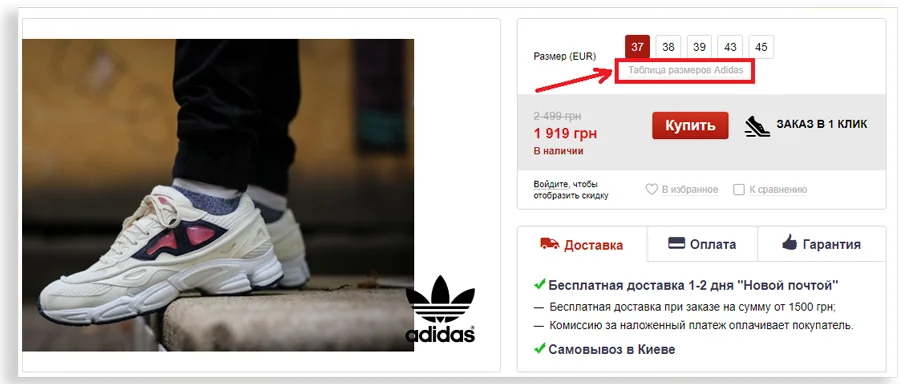
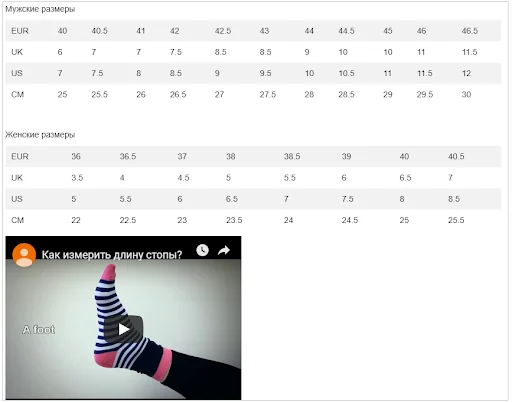
Also, on the product card, you need to indicate dimensional grids, if necessary. Different manufacturers may have different sizes. Dimensional grids eat up a lot of space, so it’s better to place only a clickable “Size Chart” button on the product card. After clicking on it, either a new page will open, or a pop-up window will appear with detailed information. Instructions can be added to the table, for example, how to properly measure the foot.
breadcrumbs
This part of the product card allows you to navigate the online store and return to the desired page in a few clicks. Such an element is especially important for users who went to the product card directly from the search engine. The client will be able to see the names of sections and subsections of the online store and, possibly, see other products.
Terms of delivery, guarantee and return
If analytics shows that users visit your site, go to the product card, but then leave - think about what could stop them. Perhaps you should place a block with delivery conditions and return guarantees next to the Buy button. Having received the most complete information, users will be able to get rid of doubts and make a purchase.
Use tabs and pop-ups to style these blocks. This will help users get all the information they need, and the page itself will not look overloaded.
On the product card, you should also indicate the estimated delivery date, so that customers understand whether it suits them. Many people buy goods for a specific date, for example, for a birthday. Not receiving the package with the order on time, the user may leave a negative review.
How to design the marketing fields of a product card
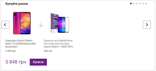
Bundle or "Buy Together"
This is the field at the bottom of the product card, which shows the products that can be purchased in the kit. These can be products from the same set or products that will still need to be purchased. For example, a case or protective glass for a specific smartphone model. To increase the motivation to buy, you can offer a discount on the set.
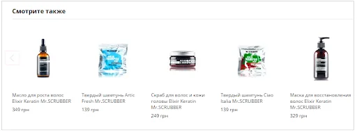
Personalized recommendations
The fields "Recommended products", "Similar products" and "See also" help to increase the average check by prompting the user to select one or more items. For example, if a client puts shampoo for dry hair in the basket, he can be offered a balm or mask from this series. The user will not have to search for these products on their own, and you will receive additional sales.
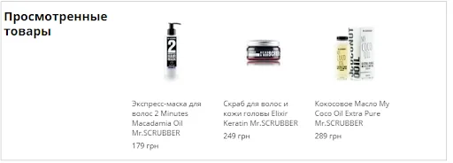
Products viewed
This field allows you to return to previously viewed products in one click. The block should be placed under the main information. It will be useful if you have a lot of doubtful customers who look at products for a long time, but do not place an order.
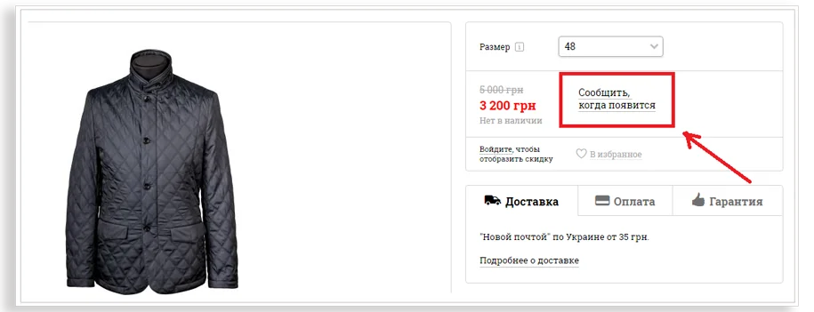
Report availability button
If the user liked the product, but it is not available in the desired color or size, he can use the "Notify when in stock" button. When the product becomes available, the user will receive a notification email.
The “Notify when available” button is better placed in place of the “Buy” button. This is the first thing the user looks for on the page, so he immediately knows that he has the opportunity to get the desired product, but a little later.
Add to Favorites or Add to Wishlist Icon
This icon allows the user to add the products they like to their wish list. It is better to place it near the "Buy" button.
After a certain time, you can start a chain of letters with a reminder of the products that are in your favorites. In letters, you can offer discounts on the products you like and warn that the product will soon be withdrawn from sale.
Wish Icon
Wish List Email Marketing
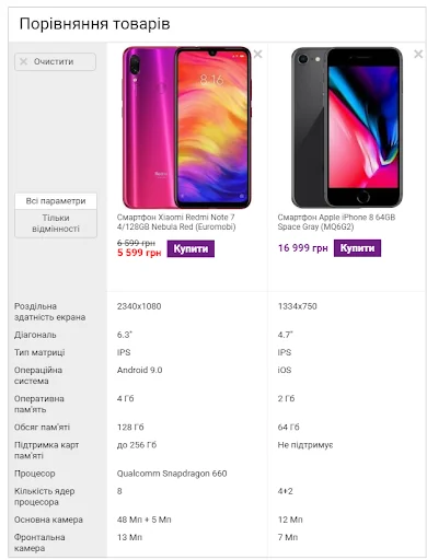
Add item to compare list
This function is very useful for products with a lot of technical characteristics: gadgets, household appliances, baby strollers, etc. It clearly shows how the two products differ. It should be placed at the top of the page, not far from the "Buy" button.
Button in the product card
Comparison of two selected products on the site
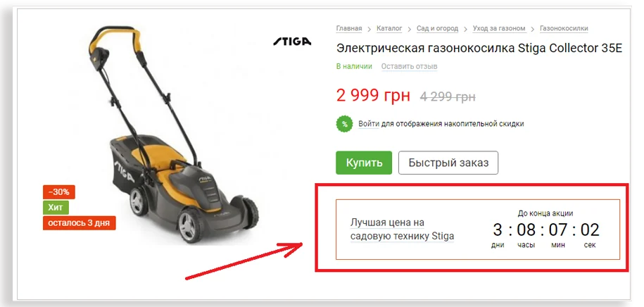
stock countdown
Such a widget visually visualizes the limited duration of the promotion, and motivates users to place an order as soon as possible.
Online shopping place this block differently. It works well both above and below the price. The main thing is to use the countdown function in a dosed way, not on every product.
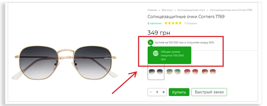
Accumulative discount
This field in the product card shows what kind of discount the user receives due to constant purchases. For example, an online store can offer a 10% discount on all products if the total amount of customer purchases is more than UAH 2,000.
A cumulative discount motivates users to log in to an online store. In the future, you can use this information in marketing activities.
Сonclusions
To create an “ideal” product card, you need to know your product, audience, and the specifics of the niche in which you work. Be sure to test all changes and implement the most successful solutions - there is no one right recipe. If your buyer likes the visual, price and description of the product, the likelihood that he will make a purchase will increase significantly.
A source: Promodo.ua


