
- How to format the main fields of a product card
- Photos and videos
- Price of the product
- Buy button
- The "Order in one click" or "Quick order" button
- Product description and specifications
- Reviews
- Selection of modifications
- Breadcrumbs
- Delivery, warranty and return terms
- How to design marketing fields on a product card
How to format the main fields of a product card
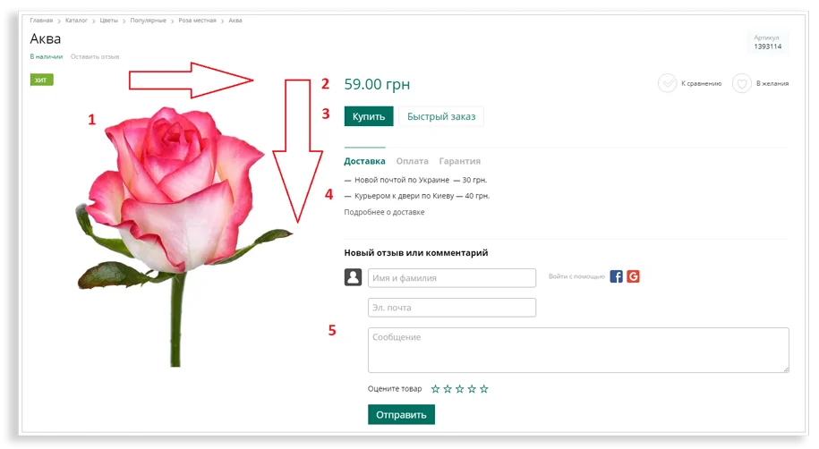
When a user opens a page, they should immediately notice the photo, price, payment and delivery terms, and the “Buy” button. That’s why designers make these key elements bright and position them along the user’s gaze. The main anchor and brightest spot is the photo; it’s where the user begins to view the page.
Photos and videos
Customers can’t see or touch the product in person, so photos must be high-quality and varied. They should showcase the product from different angles, as well as its texture and details.
You can use a magnifying glass on a product card to allow customers to examine the product in more detail. It allows users to zoom in on any part of the image.
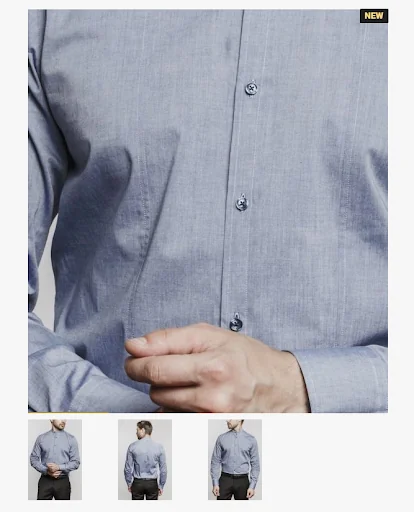
If you can show a product in use, do so. For example, seeing a dress on a model will help users better appreciate its fit and overall appearance.
Not all products require detailed photographs. If you’re selling computer games, it’s better to emphasize a detailed description, instructional video, etc. Sometimes, just showing the original packaging in a photograph is enough.
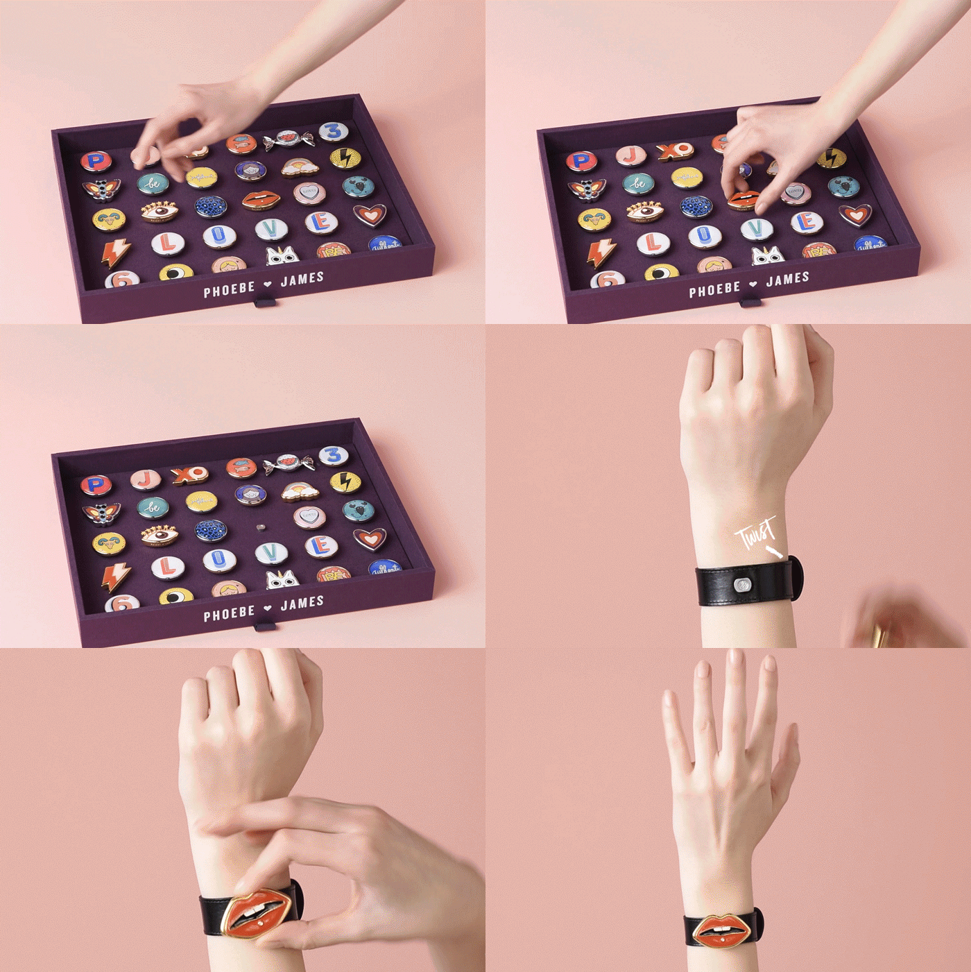
If you have the resources, it’s worth making video reviews: explaining the product’s features and showing how they look in person. A good video will highlight all the product’s advantages in a short period of time.
Price of the product
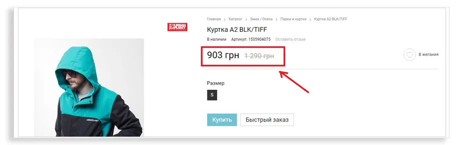
It should be a central element of the product page. Many users choose products based on price. To further motivate customers to buy and clearly demonstrate the savings, use a crossed-out old price.
Price is often the first thing people look at, so it’s best to place it at the top of the page near a prominent “Buy” button. If the price isn’t particularly attractive, you can distract from it by displaying prominent upgrades or loyalty program terms nearby.
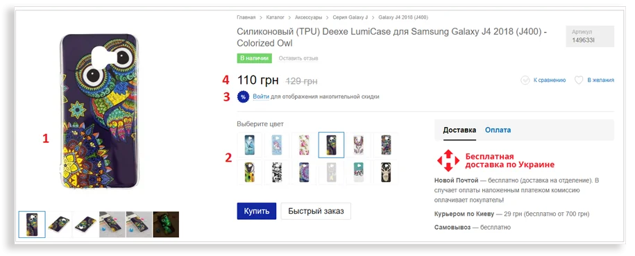
The eye doesn’t immediately move to the price, but rather through various modifications and the offer to register and receive a discount.
Buy button
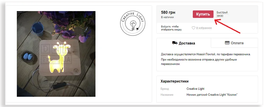
The “Buy” or “Add to Cart” button should be prominently displayed. The space around it should be clear so that nothing distracts the user from their primary task—buying the product.
Some tips for the Buy button:
- its color should differ from the color scheme of the online store for greater contrast;
- the button should be large and attract the attention of visitors;
- It should clearly indicate what users should do.
The “Order in one click” or “Quick order” button
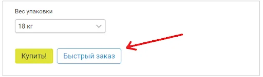
This button is useful for users who don’t want to fill out personal information and prefer to discuss the order details with a manager over the phone. It should be placed next to the “Buy” button, but less prominently. It’s more beneficial for online stores to have customers fill out personal information, as this helps build a database for email marketing and create personalized newsletters.
Product description and specifications
Some users are knowledgeable about the products you sell, while others are not. Product information should be useful and understandable for everyone.
- Anticipate questions your customers might have and answer them in your description.
- Place the most important information at the beginning of the text. You can highlight it in bold.
- If the description text is long, use subheadings and paragraphs to make it easier to read.
- If you can shorten the text without losing its information content, do it.
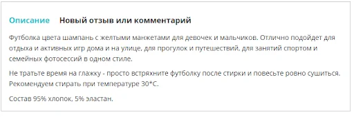
Present your products as part of a specific lifestyle. Think about how your product can help make your users’ lives more fun, enjoyable, or efficient. Show how a bicycle can make a customer healthier and happier, or how sunglasses can help them stay on trend.
If necessary, explain how you set your price. Many customers prefer not to buy expensive items online. If you’ve decided to work with a premium product, it’s worth explaining in the product description why the price is so high: discuss the cost of high-quality materials, manufacturing processes, etc.
Reviews
Reviews add credibility to a product page and increase conversion. Text reviews, Instagram photos, and video reviews are all great ways to build trust. To encourage customers to leave reviews, you can encourage them to ask questions directly on the product page.
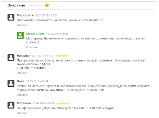
Text reviews
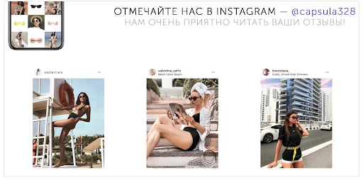
Reviews from Instagram
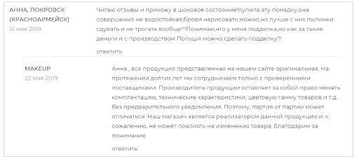
Don’t delete negative reviews. They increase trust in your online store. Respond to them appropriately.
Selection of modifications
This feature allows you to switch to the same product in a different color, material, etc. with one click. It’s very convenient if, when you switch the color icon, the product automatically changes color.
When implementing such a feature, consider not only logic and usability but also competitors’ examples. For example, online furniture stores typically display available product colors in colored squares. Users are already accustomed to this presentation. If you decide to break these rules, proceed with caution.
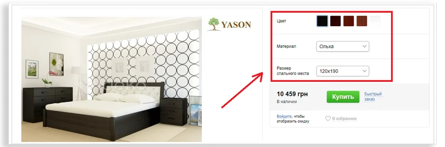
Modifications should be arranged in a logical order: price at the top, followed by color selection, memory size selection, and the “Buy” button. This gives users a clear path to follow and motivates them to make a purchase.
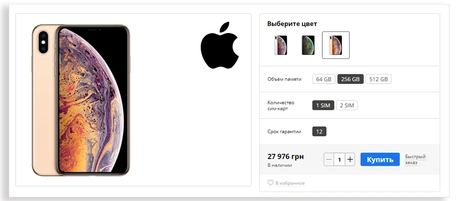
If there aren’t too many options and their names aren’t too long, it’s better to display all modifications in a row, without using a drop-down list. Clicking on the list is an unnecessary step that can often be avoided.
It’s best to gray out out-of-stock modifications. Unnecessary clicks to out-of-stock products irritate users.
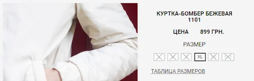
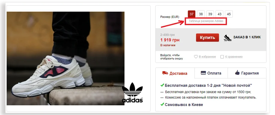
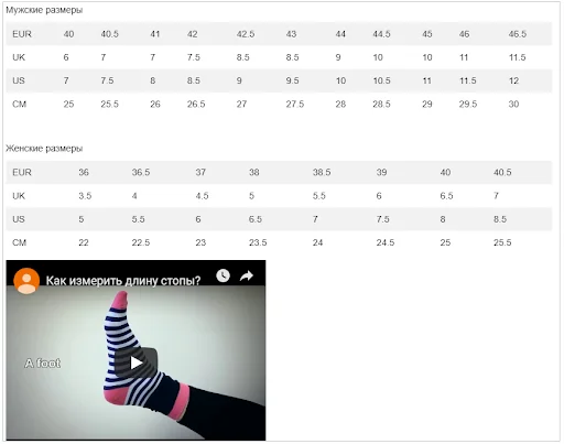
Size charts should also be included on the product card if necessary. Different manufacturers may have different sizes. Size charts take up a lot of space, so it’s best to only include a clickable “Size Chart” button on the product card. Clicking it will either open a new page or a pop-up window with detailed information. You can also add instructions to the chart, such as how to measure your feet correctly.
Breadcrumbs
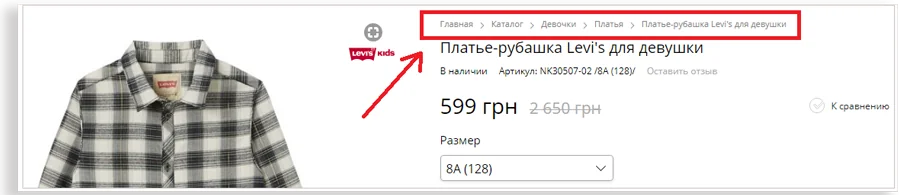
This section of the product page allows users to navigate the online store and return to the desired page in just a few clicks. This element is especially important for users who access the product page directly from a search engine. Customers will be able to see the names of the online store’s sections and subsections and possibly view other products.
Delivery, warranty and return terms
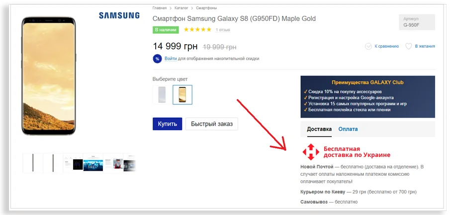
If analytics show that users are visiting your website, clicking through to the product page, but then leaving, consider what might have stopped them. Perhaps you should include a section with delivery terms and return guarantees near the “Buy” button. With as much information as possible, users will be able to resolve their doubts and complete their purchase.
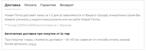
Use tabs and pop-ups to design these blocks. This will help users access all the information they need without making the page feel overly cluttered.
It’s a good idea to include an estimated delivery date on the product page so customers know if it’s suitable for them. Many people buy products for a specific date, such as a birthday. If they don’t receive their order on time, they may leave a negative review.
How to design marketing fields on a product card
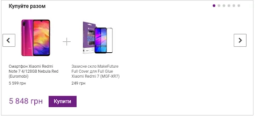
Bundle or “Buy Together”
This field at the bottom of the product card displays items that can be purchased as a set. These can be items from the same set or items that still need to be purchased separately, such as a case or screen protector for a specific smartphone model. To increase incentive to purchase, you can offer a discount on the set.
Personalized recommendations
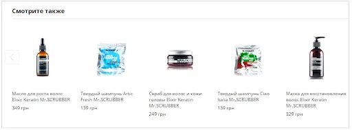
The “Recommended Products,” “Similar Products,” and “See Also” fields help increase the average order value by prompting users to select one or more additional items. For example, if a customer added shampoo for dry hair to their cart, you could suggest a conditioner or mask from the same line. This eliminates the need for users to search for these items, and you’ll generate additional sales.
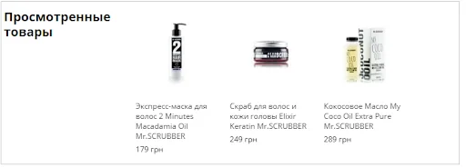
Viewed products
This field allows you to return to previously viewed products with one click. It’s best to place the block below the main information. It’s useful if you have many hesitant customers who spend a long time browsing products but don’t place an order.
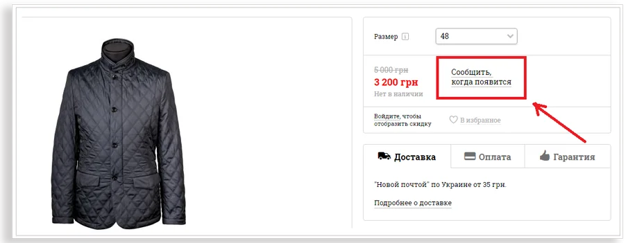
Notify me when available button
If a user likes a product but it’s not available in the desired color or size, they can use the “Notify when available” button. They’ll receive a notification email when the product becomes available.
It’s best to place the “Notify when available” button in the same place as the “Buy” button. It’s the first thing users look for on the page, so they’ll immediately know they can get the item they want, but it’ll be available later.
Add to Favorites or Wishlist icon
This icon allows users to add desired items to their wishlist. It’s best placed near the “Buy” button.
After a certain amount of time, you can launch an email sequence reminding users about favorite products. These emails can offer discounts on favorite items and warn them that the product will soon be discontinued.
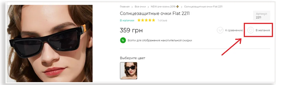
The “Wishlist” icon
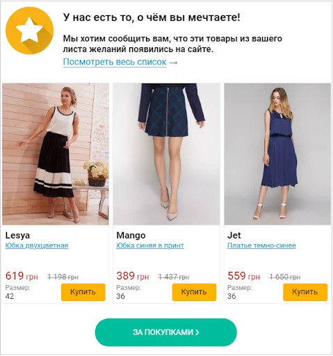
Email newsletter with items from your wishlist
Add product to comparison list
This feature is especially useful for products with a large number of technical specifications: gadgets, home appliances, strollers, etc. It clearly shows the differences between two products. It should be placed at the top of the page, near the “Buy” button.
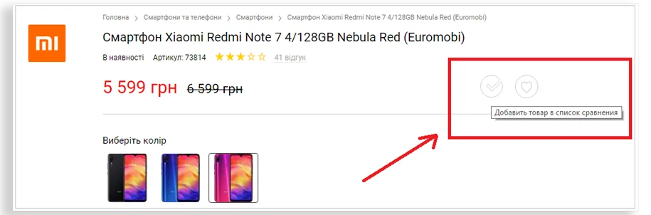
Button in the product card
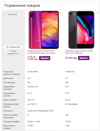
Comparison of two selected products on the website
Stock Countdown
This widget clearly displays the limited-time nature of the promotion and motivates users to place their order as soon as possible.
Online stores place this block differently. It works well both above and below the price. The key is to use the countdown function sparingly, not on every product.
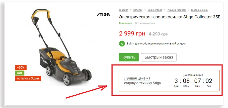
Cumulative discount
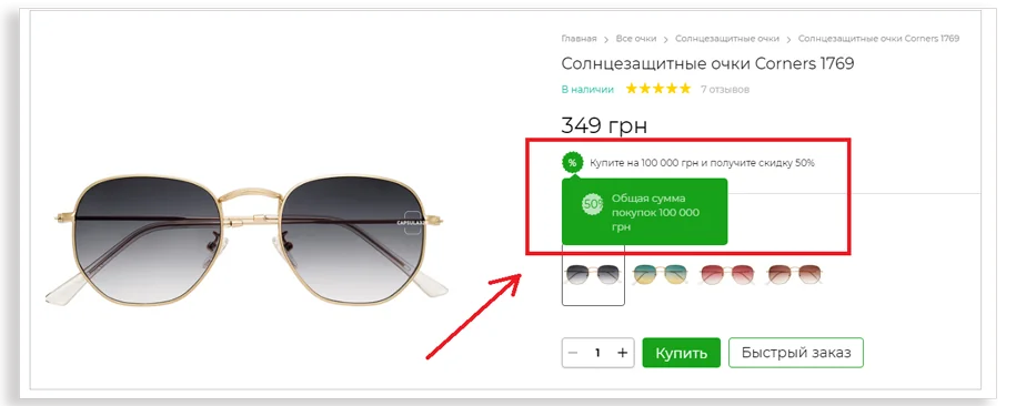
This field on the product card shows the discount the user receives for repeat purchases. For example, an online store might offer a 10% discount on all products if the customer’s total purchase amount exceeds two thousand hryvnias.
A cumulative discount motivates users to log in to your online store. You can then use this information in your marketing efforts.
Conclusions
To create the “perfect” product card, you need to thoroughly understand your product, your audience, and the specifics of your niche. Be sure to test all changes and implement the most successful solutions—there’s no single right formula. If your customer likes the visuals, price, and description, the likelihood of them making a purchase will increase exponentially.
Source: Promodo.ua